Qt GUI feature suggestion thread

Post Reply
dualscreenman
Member
Posts: 50
Joined: Tue Mar 18, 2008 9:27 am

Qt GUI feature suggestion thread

Post by dualscreenman »

Suggest features for the new cross-platform Qt GUI here!


Unimplemented

In progress

Implemented


Existing ideas:

-Rom browser that uses a tab system for the individual rom types.


-Cheat List dialog screen should be more like No$GBA's.

When adding a cheat it should group them by cheat name instead of the E/D items it should just show on and off.


-Cheats should be editable as well, just like NoGBA's.


-GSA and CBA should be unified into one button marked as Add Code.

Seeing as from what I've heard and tested' date=' AR Codes, GSA Codes. and CBA codes are all addable via the Gameshark and Codebreaker buttons.[/quote'] 

-Support for custom Qt themes.

<blockquote data-ipsquote="" class="ipsQuote" data-ipsquote-contentapp="forums" data-ipsquote-contenttype="forums" data-ipsquote-contentid="10" data-ipsquote-contentclass="forums_Topic"><div>As it stands' date=' the QT apps I've seen have had issues with showing radio buttons and confirmation button outlines when a non standard windows theme is in use.[/quote'] 

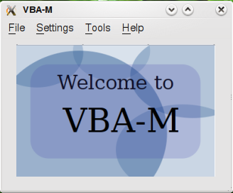
-An SVG splash startup-background.

Image

Image

Note that the above is purely a mockup.

Mudlord suggested a 3D cube with the splash on the sides. Image/emoticons/smile@2x.png 2x" width="20" height="20" />


-Sidebar with common emu functions.

Work on this has already started with the cheat sidebar.


-Use Oxygen icons for teh sex valuez.

Integration has already begun.

</div></blockquote>

Last edited by dualscreenman on Tue Mar 18, 2008 6:35 pm, edited 1 time in total.
mudlord
Senior Member
Posts: 306
Joined: Sun Feb 08, 2009 7:16 am

Qt GUI feature suggestion thread

Post by mudlord »

Topic stuck. :cool:

deniseweird
Junior Member
Posts: 28
Joined: Thu Mar 20, 2008 7:53 am

Qt GUI feature suggestion thread

Post by deniseweird »

The splash screen will take up the whole window, won't it? (No, I am not counting in menu bars etc [img]<fileStore.core_Emoticons>/emoticons/tongue.png[/img]/emoticons/tongue@2x.png 2x" width="20" height="20" /> you know what I mean.) Just having it centered in the middle of a lot of gray space doesn't look so good. I know it's a mockup, and this may be a stupid question, but I wanted to make sure. ^^;;

dualscreenman
Member
Posts: 50
Joined: Tue Mar 18, 2008 9:27 am

Qt GUI feature suggestion thread

Post by dualscreenman »

Yeah, it could be resized to show way less window space. I just was lazy and didn't want to for the mockup. Image/emoticons/tongue@2x.png 2x" width="20" height="20" />


Oh, I also had another idea...


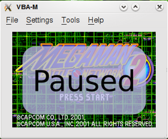
An SVG pause overlay.

Image


Mockup:

Image

This way you can easily tell that emulation is indeed paused.


It would probably be better to make that configurable if it ever did get implemented, since I can see times when I'd want to pause emulation and get a better look at the screen. Oh! Oh!. Idea! Maybe you could click to hide it...

Last edited by dualscreenman on Thu Mar 20, 2008 8:18 am, edited 1 time in total.
deniseweird
Junior Member
Posts: 28
Joined: Thu Mar 20, 2008 7:53 am

Qt GUI feature suggestion thread

Post by deniseweird »

Why not do this for all messages? You could use Amarok-like OSD btw. If you reset for example, the OSD says Reset, looking nice and all :3

dualscreenman
Member
Posts: 50
Joined: Tue Mar 18, 2008 9:27 am

Qt GUI feature suggestion thread

Post by dualscreenman »

Good idea. I'd be willing to provide artwork if the idea ever gets implemented.

spacy51
Senior Member
Posts: 371
Joined: Tue Mar 18, 2008 4:59 pm

Qt GUI feature suggestion thread

Post by spacy51 »

OSD sounds like a good idea.

However, it is stupid to fill the whole screen with a pause message...

Just a little 50% transparent hint in one of the edges should be enough.

xKiv
Junior Member
Posts: 36
Joined: Fri Mar 21, 2008 9:47 am

Qt GUI feature suggestion thread

Post by xKiv »

You could also just make the window a little bit taller and put a scrolling log (history) of messages there ... preferably with a timestamp (and I would appreciate a current time indicator too [img]<fileStore.core_Emoticons>/emoticons/smile.png[/img]/emoticons/smile@2x.png 2x" width="20" height="20" />.


I wanted to do this myself (in the SDL port), but just ended up echoing all messages to STDOUT ...


Oh, and as for the "paused" state, I just printed Pause on/Pause off ...


This would also solve the "messages hide part of the picture" problem (like when I save/load a state ...). Simply send all the messages to the message window instead of laying them over the emulated screen.

TheCloudOfSmoke
Junior Member
Posts: 8
Joined: Tue Mar 18, 2008 6:03 pm

Qt GUI feature suggestion thread

Post by TheCloudOfSmoke »

I don't like the whole splash screen thing or the pause thing. Too much going on which makes the emulator look unprofessional imo. Why not just have a hidable/showable status bar at the bottom like Nestopia where all of the status messages will go. I don't like the current in-screen red text method of the status messages. It should be separate from the gameplay completely except when it's in full screen mode.

Last edited by TheCloudOfSmoke on Wed Mar 26, 2008 11:58 pm, edited 1 time in total.
Squall Leonhart
Posting Freak
Posts: 1223
Joined: Tue Mar 18, 2008 9:21 am

Qt GUI feature suggestion thread

Post by Squall Leonhart »

You could also just make the window a little bit taller and put a scrolling log (history) of messages there ... preferably with a timestamp (and I would appreciate a current time indicator too [img]<fileStore.core_Emoticons>/emoticons/smile.png[/img]/emoticons/smile@2x.png 2x" width="20" height="20" />.


Definitely not, GDI detracts from emulation performance as it is without further adding more gdi objects, VBA already has a logging window, we can improve upon this instead


Onscreen display is as such for a reason, granted theres no reason to have the cpu info shown in the window when set to windowed mode as the information is already in the title bar, but when in fullscreen, it is good to have an idea of performance levels especially for performance debugging.


Consistency between the render modes is to be worked on so that both d3d and opengl have the OSD in the same places, and the same sizes

Post Reply